Configuring Custom CSS Styling in the Portal
The Custom CSS capability in the Fenergo Portal empowers configurators with the ability to apply tailored styling directly into the portal UI, without requiring code deployment or backend changes. This feature enables highly flexible branding and accessibility enhancements across both Standard Mode and High Contrast Mode.
Custom CSS gives teams the power to:
- Apply organistion-specific visual themes quickly and consistently
- Enhance accessibility with targeted styles for high contrast scenarios
- Make rapid non-disruptive visual updates in response to client feedback
- Override the default appearance of key components in a safe and controlled way
All custom styles are scoped to supported components and validated prior to application, ensuring consistency across the platform without compromising layout or responsiveness.
Accessing the Custom CSS Fields
Two text area fields are available within the Portal Administration UI for entering custom CSS:
| Mode | Field Name | Location in UI |
|---|---|---|
| Standard Mode | Standard Mode CSS | Portal Configuration Area > Appearance Config |
| High Contrast Mode | High Contrast Mode CSS | Portal Configuration Area > Appearance Config |
These fields accept raw CSS input, which is applied immediately after saving. Each field applies styling to its corresponding mode only.
Validation Rules
To preserve portal layout integrity and user experience, the following rules are enforced:
- Only supported CSS class selectors (listed below) may be used.
- The following CSS properties are blocked:
width,min-width,max-widthheight,min-height,max-height
If unsupported class names or blocked properties are used, the following error appears:
"Invalid CSS. The configurator will need to remove this before the CSS can be saved."
Only the following pseudo-classes are allowed in custom CSS:
:hover:active:focus:enabled:disabled:checked
Supported CSS Classes
Custom CSS can target only the predefined, supported class names listed below. Each class must be prefixed with .custom-css_ when referenced in the CSS input. There are 67 supported classes across 16 feature areas.
Common
| Friendly Name | Custom CSS Class Name |
|---|---|
| New Journey Wrapper | .custom-css_new-journey-box |
| Background Image Holder | .custom-css_background-image-holder |
| App Bar | .custom-css_app-bar |
| Data Group Add Item Button | .custom-css_data-group-add-item-button |
| Dashboard Link | .custom-css_dashboard-link |
| Journey Progress Bar – Text | .custom-css_journey-progress-bar-text |
| Journey Progress Bar – Background | .custom-css_journey-progress-bar-background |
| Journey Progress Bar – Completion | .custom-css_journey-progress-bar-completion |
Footer
| Friendly Name | Custom CSS Class Name |
|---|---|
| Text | .custom-css_footer-text |
Login Screen
| Friendly Name | Custom CSS Class Name |
|---|---|
| Main Heading | .custom-css_login-screen-main-heading |
| Subtext | .custom-css_login-screen-subtext |
Dashboards
| Friendly Name | Custom CSS Class Name |
|---|---|
| Default Dashboard Page Container | .custom-css_default-dashboard-page-container |
| Sidebar Menu (Drawer) | .custom-css_sidebar-menu |
| Table Dashboard Page Container | .custom-css_table-dashboard-page-container |
| Funds Dashboard Container | .custom-css_funds-dashboard-container |
| Fund Details Container | .custom-css_fund-details-container |
Entity Details
| Friendly Name | Custom CSS Class Name |
|---|---|
| Data Box | .custom-css_entity-profile-details-v1 |
| Entity Details Card | .custom-css_entity-profile-container-v1 |
Entity Hub
| Friendly Name | Custom CSS Class Name |
|---|---|
| Menu Container | .custom-css_entity-profile-menu-container |
| Content Container | .custom-css_entity-profile-content-container |
| Entity Details Container | .custom-css_entity-profile-details-container |
| Data Group Record Accordion | .custom-css_entity-profile-data-group-record-accordion |
| Data Group Record Accordion (Expanded) | .custom-css_entity-profile-data-group-record-accordion-expanded |
| Data Group Record Accordion Summary | .custom-css_entity-profile-data-group-record-summary |
| Data Group Record Accordion Summary (Expanded) | .custom-css_entity-profile-data-group-record-summary-expanded |
| Data Group Record Accordion Summary Title | .custom-css_entity-profile-data-group-record-summary-title |
| Data Group Record Accordion Details | .custom-css_entity-profile-data-group-record-accordion-details |
Journey
| Friendly Name | Custom CSS Class Name |
|---|---|
| Sticky Header | .custom-css_journey-sticky-header |
| Header Extended Background | .custom-css_journey-header-extended-background |
| GPI Container | .custom-css_gpi-container |
| GPI Journey Info | .custom-css_gpi-journey-info |
| GPI Journey Name | .custom-css_gpi-journey-name |
| GPI Process Container | .custom-css_gpi-process-container |
| GPI Process Name | .custom-css_gpi-process-name |
| GPI Task Item Container | .custom-css_gpi-task-item-container |
| GPI Task Button | .custom-css_gpi-task-button |
| GPI Task Name | .custom-css_gpi-task-name |
| Task Container | .custom-css_task-container |
Task Details
| Friendly Name | Custom CSS Class Name |
|---|---|
| Task Header | .custom-css_task-details-header |
Product Task
| Friendly Name | Custom CSS Class Name |
|---|---|
| Tabs Container | .custom-css_product-task-tabs-container |
| Tab | .custom-css_product-task-tab |
Documents
| Friendly Name | Custom CSS Class Name |
|---|---|
| Document Requirement Row (v1) | .custom-css_documentV1-requirement-row |
| Document Requirement Row (v2) | .custom-css_documentV2-requirement-row |
| Linked Documents Container (v2) | .custom-css_documentV2-requirement-row-linked-docs-container |
E-Signature
| Friendly Name | Custom CSS Class Name |
|---|---|
| Documents to Sign Container | .custom-css_esignature-documents-to-sign-container |
| Read & Understand Checkbox Container | .custom-css_esignature-read-and-understand-checkbox-container |
| Single Requirement Panel | .custom-css_esignature-single-requirement-panel |
| Requirement Signers Section | .custom-css_esignature-requirement-signers-section |
| Requirement Documents Section | .custom-css_esignature-requirement-documents-section |
| Requirement Accordion | .custom-css_esignature-requirement-accordion |
| Requirement Accordion (Expanded) | .custom-css_esignature-requirement-accordion-expanded |
| Requirement Accordion Summary | .custom-css_esignature-requirement-accordion-summary |
| Requirement Accordion Summary (Expanded) | .custom-css_esignature-requirement-accordion-summary-expanded |
| Requirement Accordion Summary Title | .custom-css_esignature-requirement-accordion-summary-title |
| Requirement Accordion Details | .custom-css_esignature-requirement-accordion-details |
Tooltip
| Friendly Name | Custom CSS Class Name |
|---|---|
| Header Background | .custom-css_tooltip-header-background |
| Container | .custom-css_tooltip-container |
| Icon | .custom-css_tooltip-icon |
Markdown
| Friendly Name | Custom CSS Class Name |
|---|---|
| Chip | .custom-css_markdown-chips |
Checkbox List
| Friendly Name | Custom CSS Class Name |
|---|---|
| Container | .custom-css_checkbox-list-container |
| Checkbox Item | .custom-css_checkbox-list-checkbox |
| Checkbox Item Label | .custom-css_checkbox-item-label |
Radio List
| Friendly Name | Custom CSS Class Name |
|---|---|
| Container | .custom-css_radio-list-container |
| Radio Item | .custom-css_radio-list-radio-item |
| Radio Item Label | .custom-css_radio-item-label |
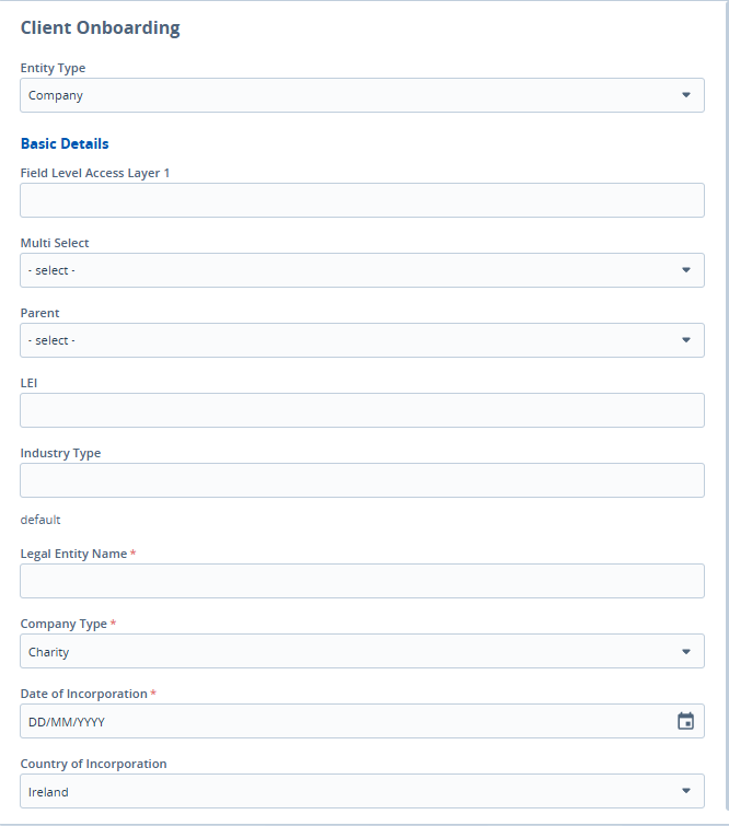
Form
| Friendly Name | Custom CSS Class Name |
|---|---|
| Input | .custom-css_form-input |
| Text Area | .custom-css_form-text-area |
| Label | .custom-css_form-label |
| Field Group Category Title | .custom-css_form-field-group-category-title |
Button
| Friendly Name | Custom CSS Class Name |
|---|---|
| Primary | .custom-css_button-primary |
| Secondary | .custom-css_button-secondary |
Images of areas within the Portal:
New Journey Wrapper
Background Image Holder
App Bar

Add Data Group Button

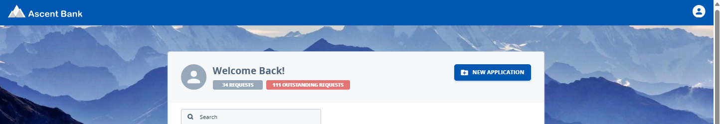
Default Dashboard Page Container
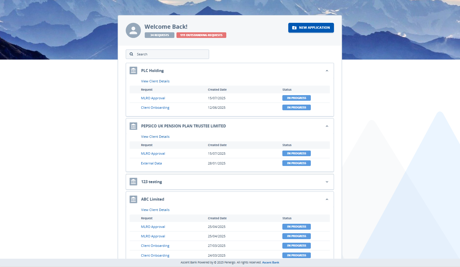
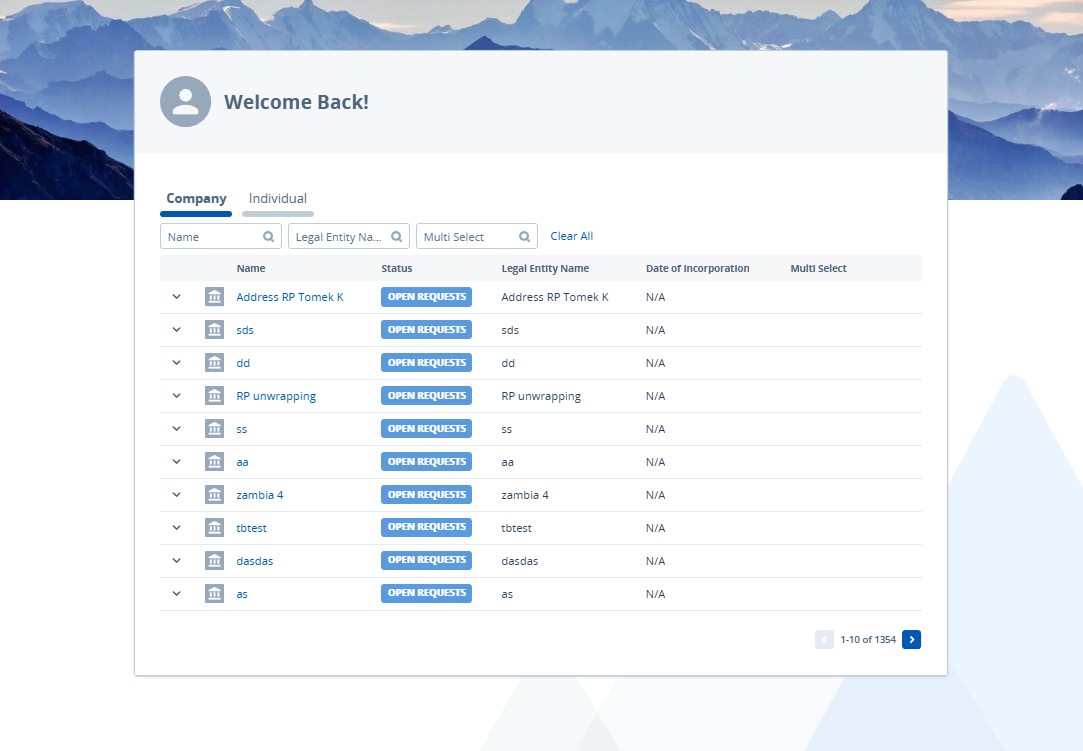
Table Dashboard Page Container
Funds Dashboard Container
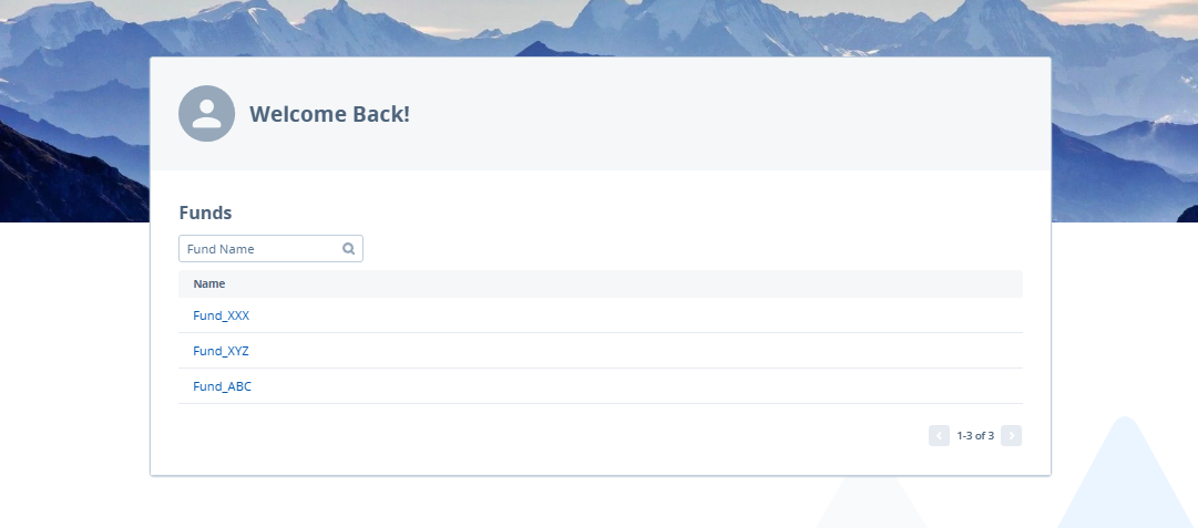
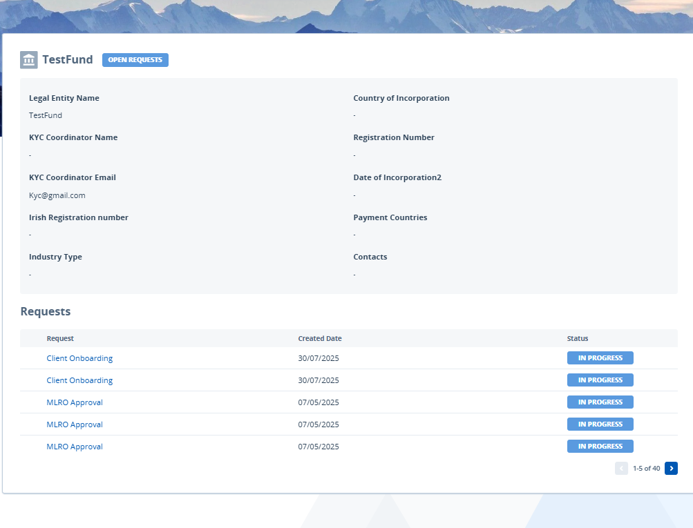
Fund Details Container
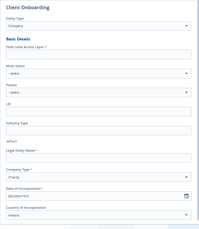
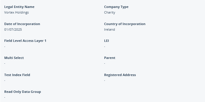
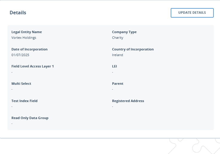
Entity Profile Details Box / Entity Profile Details Container
Entity Details Card
Entity Profile Menu Container

Entity Profile Content Container
Journey Sticky Header

Journey Header Extended Background
GPI Container
Task Container
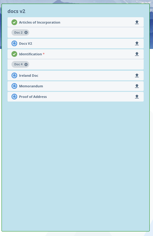
Document Requirements Row V1
Document Requirements Row V2
Linked Documents Container V2
Finding Targetable Elements Using Browser Developer Tools
Not all elements in the Portal are targetable via Custom CSS — only elements that carry a .custom-css_ class can be styled. Browser developer tools can be used to determine whether a given element is eligible for customisation before writing any CSS rules.
Inspecting a Specific Element
To check whether a particular element can be targeted:
- Navigate to the Portal and locate the element to be styled.
- Right-click the element and select Inspect (or Inspect Element) from the context menu. The browser's Developer Tools panel opens with that element highlighted in the HTML tree.
- Look at the
classattribute of the highlighted element or any of its parent elements. If a class beginning withcustom-css_is present, the element is targetable.
For example, an element with class="custom-css_app-bar" can be styled using .custom-css_app-bar { ... } in the Custom CSS field.
Searching the Page Source for Custom CSS Classes
To get an overview of all targetable elements currently rendered on a page:
- Open Developer Tools (right-click anywhere on the page and select Inspect, or press F12).
- In the Elements panel, press Ctrl+F (Windows) or Cmd+F (Mac) to open the search bar within the HTML tree.
- Type
custom-css_to highlight all matching elements in the DOM.
Any element returned by this search can be targeted in the Custom CSS configuration fields.
If an element does not have a custom-css_ class, it cannot be styled using the Custom CSS feature, regardless of other class names present on the element.
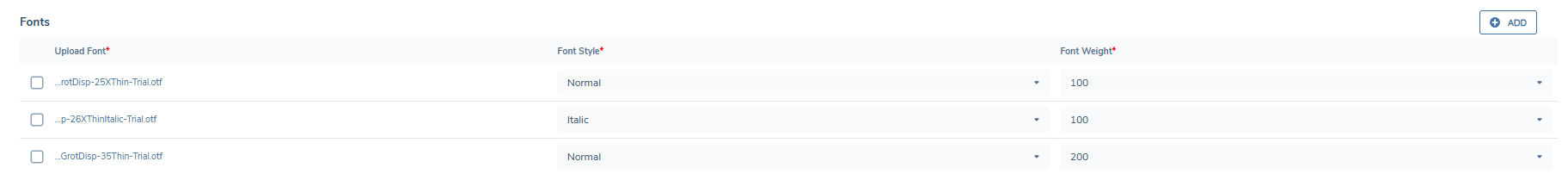
Fonts
The Fonts section enables Portal configurators to upload and manage a custom font family to be used across the Portal UI. This allows each tenant to align the Portal experience with their organisation’s branding and visual identity. Uploaded fonts are applied globally to all headings, body text, form fields, buttons, tables, modals, and notifications within the Portal.
A fallback font stack (beginning with Open Sans) is automatically applied if a custom font cannot be loaded, ensuring the UI remains accessible and readable.
Uploading Fonts
From Portal Configuration > Appearance, scroll to the Fonts section (located after the Custom CSS section).
- Click Add to begin uploading a font file.
- Supported file types: .woff, .woff2, .ttf, .otf.
- For each file, you must specify:
- Font Style: Normal or Italic
- Font Weight: Choose from 100–900, or define a range (e.g., 100–900)
Multiple files can be uploaded to support different styles and weights within the same font family (e.g., bold italic, light normal). This ensures text is rendered consistently throughout the Portal.
Managing Fonts
- Add Button: Add more font files to the same family until the upload limit is reached.
- Delete Icon: Remove unwanted fonts. When a font in use is deleted, the Portal reverts to the fallback font.
Behaviour Notes
- If no fonts are uploaded, the Portal continues to use the default font stack.
- Once uploaded, the custom font is applied globally wherever matching
font-styleandfont-weightcombinations are used in the UI.
Auth0 login page
To ensure the correct font is used, a font file with the Font Style: Normal and Font Weight: 400 must be configured. If this is not configured, the Auth0 login page will automatically use the portal default font.